
Poverty in London: inner city and suburbs
In the course of research on trends in poverty in London from 2000 to 2011, some interesting findings on the spatial distribution of poverty in the city emerged. These suggested that, at neighbourhood level, poverty rates in much of the historically deprived inner city had fallen, sometimes quite dramatically. Over the same period poverty rates had increased in suburban areas.
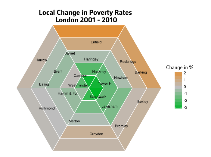
I presented an initial discussion of the findings in a blog post, which included the map (or rather, cartogram) below. It divides London into thirty sectors, arranged around the centre and working from inside to out. For each it shows the change in a poverty rate measure between 2001 and 2010. Green shading indicates falling poverty, and orange, rising. The approximate location of a selection of London boroughs is shown.
Measurement, Meaning, Representation
The analysis poses questions about measurement (how ought we quantify poverty at small geographic scales?); about representation (how can change over time be conveyed?); about interpretation (to what can changes be attributed?); and about meaning (what sociological or political significance do such measures have?). The commodification of housing as ‘cause’ is discussed at greater length in an article in Cities, and problems of small area poverty measurement are treated in a CASE working paper. Here I want briefly to address conveying such findings visually.
A conventional way of representing change over time is to show the two points in time side-by-side, projecting each neighbourhood’s geographic shape onto the ink/pixel space, and painting it in a colour corresponding to the measure - from grey (low poverty) through orange to pink (high poverty).
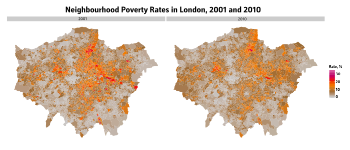
There are several shortcomings with the side-by-side approach:
- The visual importance of each spatial unit depends on its spatial extent, not its population size or corresponding contribution to the overall distribution of poverty. This is a well-established principle — a founding precept — in the literature on cartograms. Here it means that the substantial changes in the densely populated centre are harder to discern than the relatively sparse suburbs.
- The colour range for values indicates only large changes in a relatively narrow range (between “high” and “very high”) and underplays the effects of more modest trends in the middle.
- It is taxing to make comparisons: to identify one or several zones in the baseline, and then find the corresponding zones in the later map. It doesn’t provide a summary view of the broad types or locations of change.
The sector map, above, tries to address this. We are mainly interested in showing the summary contrast between inner and outer areas, and the differences between broad segments of London (for example, the South-West is largely wealthy and little affected by the spatial movement of poverty in the city).
Technique
As chance would have it, London has a roughly circular shape. We can thus group neighbourhoods by their having a particular distance from the population centre, and a particular orientation to it. In other words, geo-spatial locations are converted to polar co-ordinates, ranking each neighbourhood by distance from the city centre for its ‘innerness’, and allocating it to a slice by its orientation to the centre. Checks were made to see whether each slice contained a roughly similar number of neighbourhoods and thus population.
The poverty rates are proxies based on benefits data; they are counts of adults claiming out-of-work benefits, divided by the total working-age population. A rate for each sector in each year is calculated by summing benefit claimants and dividing by the summed working-age population. The change is the difference between the two years (the overall income poverty rate in London hardly changed).
The change is represented as a three-colour scale, with grey in the middle representing no change. To orient those familiar with London, the approximate locations of some London boroughs are shown. Their population centroids are projected onto the artificial space by their orientation to and distance from London’s centre.
Here’s an R-statistics script that shows roughly how this was done, including allocating the neighbourhoods to sectors, and drawing a hexagonal map using ggplot2. It isn’t in itself runnable but get in touch if of interest.
Other Comments
The cartogram doesn’t, in fact, devote equal page-space to equal population - the outer tiers have similar total populations to the inner, but occupy considerably more space. This could be compensated for, but firstly as it is it conforms more closely to a traditional map, and was also more aesthetically pleasing with equally-sized tiers.
The map on its own leaves open several important questions of interpretation. Firstly, the falls in poverty rates in the inner areas are mainly attributable to there being more people in total, and of different ages, in the inner city, rather than large falls in the absolute counts of the poor. Secondly, it isn’t obvious (and is hard to answer conclusively from the available sources) the extent to which it was ‘displacement’ or outwards migration of low-income households, or changing circumstances of households already there.
Finally, the capital-intensive nature of the changing character of inner London is not brought out. The rapidly growth of (mostly) non-poor households in inner London in the 2000s reflected the intensive development of new housing, much of it of higher value than the existing stock, especially in waterside and urban council estates. It was thus, then, not only the ‘classic gentrification’ of existing stock, but significantly the consequence of large flows of public and private capital, with the two often working in close concert.