
Housing Benefit changes and the displacement of the poor in London
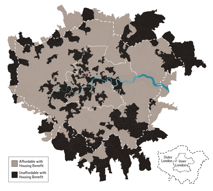
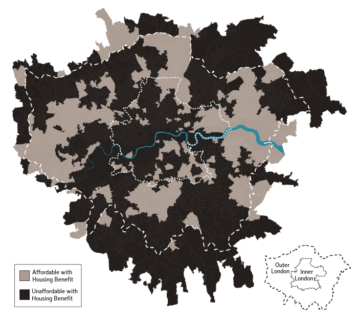
The maps show the parts of London where housing is affordable and accessible for low-income private tenants who get Housing Benefit to help pay their rent. Changes to Housing Benefit introduced in 2010 were very likely to reduce the amount of housing affordable to low-income tenants, especially in inner London.
The maps show, first, the position in 2010, when the government’s changes were announced, and then second, the projected position in 2016, when the changes would have been in effect for five years from 2011. The maps suggest that an effect of the changes would be to make the majority of inner London inaccessible to low-income tenants on Housing Benefit.
The Maps
Background
Shortly after its election in May 2010, the UK Conservative-Liberal coalition government announced a set of changes to Housing Benefit, a welfare payment that assists tenants on low-income pay part or all of their rent. The proposals curtailed the maximum amounts of rent support payable to tenants in private housing, including those already in tenancies. These caps and cuts were set in various ways, but their overall effect was to reduce expenditure by reducing the maximum rent subsidy relative to local rents.
To anyone with a reasonable knowledge of the operation of Housing Benefit it was apparent that the measures would have extremely pronounced effects on low-income tennats in London. This was because Lonodn has substantially the highest private rents in Britain with large absolute differences in typical rents between different areas, and because London has a high proportion of low-income households already receiving Housing Benefit.
The effects were known to be most severe in inner London. The effect of the measures would also grow over time, as the proposals removed the links between the setting of benefit rates and actual market rents. A probable (but disputed) consequence would be the displacement of large numbers of poor households from inner London.
Construction
I produced the maps as part of a research project at the Centre for Housing and Planning Research at the University of Cambridge. They were the results of a model and projection. The model estimated, fairly crudely, median and lower-quartile rents for a large number of small areas in London. These local rents were compared against the current maximum rates of Housing Benefit to give the status quo ante.
The rents and benefit rates were then projected into the future, taking into acccount the policy proposals and varying assumptions about rent rises. The projected local rents were then recompared to the projected benefit rates in 2011 and 2016 to indicate how the measures were likely to change where in London would be affordable and accessible to low-income tenants on Housing Reflections.
The model, projections and maps were all done in R-statistics, with data from the Land Registry, Census of Population and Valuation Office Agency. Data on local benefit entitlement had to be screen-scraped from the VOA website using Ruby, since the VOA at that time were unwilling to release this (public) information. The maps were tweaked later in Inkscape.
The full working paper reports the method and results: Housing Benefit reform and the spatial segregation of low-income households in London
Comments
The results were widely reported and reproduced in the general media for example, in the Observer and the Washington Post - the district the latter chose to mark on the map to help orient their readership are an amusing comment on Americans in London. The maps also appeared in others’ research. It’s interesting that they were reported further not because the results were surprising, but because they were anticipated. The model was not especially sophisticated, but by producing numbers it gave concrete form to what was, within the relevant policy and research circles, common knowledge. The maps in particular became a transmissible and summary expression of this knowledge. The maps as a collection of symbols and shapes do this, even though no individual element of the map represents a statement about the truth that could confidently be defended, given the scantness of the available data upon which to found the results.
Despite this the results have not, to my knowledge, been substantially challenged on empirical grounds, although they provoked a funny ad hominem outburst from a Conservative local London politician, who at least kindly mistook me for a “26 year-old undergraduate”. Nor were the proposals themselves changed substantially. Rather the political debate continued, largely unenlightened by the results, about whether low-income tenants ought to enjoy the possibility of living in certain areas. “I’m just a researcher, not an ethicist” is luckily a permissible (if perhaps sometimes bad-faith) answer when asked why low-income tenants ought to be able to afford to live in London.